Go back to Step 6: Graphic Styles
Update: The “Libraries” section of this tutorial applies if you’re using an older version of Illustrator. If you have the latest version (CC 2018 or better), I highly recommend that you use the Creative Cloud Libraries method.
In the old days of Freehand, we used to store frequently used elements on the pasteboard. I’m talking about icons, symbols, blocks of text, etc., that get used often enough to need them available. For example: on a map, you will need highway markers, a legend, inset maps, the “North” symbol, and a graphic credit.

One of the things I really like about Illustrator is the ability to save symbol libraries. (It’s been so long since I used Freehand, I don’t remember if it had symbol libraries, but it probably did.) This is where I can store all those frequently used elements without having to open a “storage” document, find what I need, and copy/paste it back to my original document. I also don’t have to store all of these icons on my pasteboard, where they might mess up my EPS exports.
Text blocks
Let’s get the easy ones out of the way first. You will probably have several graphic credits that you use frequently. These are the ones that I have in my symbol library
- San Antonio Express-News (what I use on most locally produced graphics)
- Associated Press (wire)
- MCT (McClatchy-Tribune)
- Houston Chronicle (our sister paper)
- Harry Thomas/San Antonio Express-News (for when I want to put my name on a graphic)
To create them. type them as point text and style them according to your credit style. Then go to your Library Panel and select Symbols. (If you don’t have it loaded, go to Window>Symbols.) Click on the box indicated below.

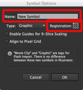
In the dialog box that opens, click “New Symbol”

In the dialog box that opens, give your symbol a name, and set the registration to the top left corner (not required, but a good practice). You can also change the Type to Graphic if you like, but this only comes into play if you’re going to export your graphics to the Flash format.
Congratulations. You just created your first symbol. Now do it again for your other graphic credits.
How to use a symbol
- Click on your symbol library.
- Select the symbol you want to use.
- Drag it into your document.
- Repeat as many times as required.
Road symbols
As you can see, I have a lot of road symbols in my library. Maps are the primary reason for having a symbol library.
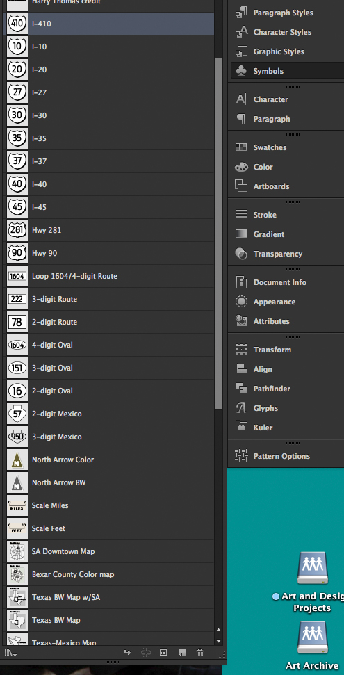
You might have observed something else: all of my highway signs are black and white, with no distinguishing internal lines. There’s a reason for this; we determined that the lines get lost anyway, and if the map changes to black and white, we don’t have to swap out symbols.
However, the shapes all conform to accepted shapes for road signs here in Texas. The Interstate signs look like interstate signs, just minus the blue and red colors. The State Highway signs all look like state highway signs; the local routes and other markers conform to those shapes found on Texas highways. You’ll need to create your own symbols and shapes. If you don’t have the drawing skills, do a search on Google for vector highway symbols.
Here’s how we put together our road symbols at the Express-News. I create each one, group them, give the group a name, and THEN turn it into a symbol, using the same name. The reason for that will be explained below, under “Breaking Links.”

There are also plenty of ways to do a “North” symbol. Note that I’ve got both color and BW versions. You can do a solo BW version, if you like, but it’s an easy element to swap out. Let’s look at that.

I selected the North Arrow Color symbol and then clicked on the “Replace” button. (Note that the symbol appears in the Replace window. The dropdown shows all of my symbols. I scroll down to the North Arrow BW and click on it. Presto: the symbol changes to my North Arrow BW symbol.
Distance marker
When creating a distance marker, you first need to decide how long you want it to be. On my base map of San Antonio, I have 2 miles marked off as 30 points. I then create a line 30 points wide and give it two upward points (see diagram). Again, I center all fonts, put the “0” marker on the left point, and the “2” on the right point. I center the word “MILES” below the line, and spread the leading just to differentiate it from any other text on the graphic.
I draw a color background box over it, then send it to the back. The reason for this is so that it covers up any elements behind (like streets) it when placed on the map.
As I did above, I group it, and I give the group the name, “Scale Miles.” THEN I turn that group into a symbol.

It’s up to you, but I also repeat this process with “FEET” in place of “MILES.”
Detail Area map
This assumes that you already have a usable map of your paper’s main coverage area. My work covers the city of San Antonio, so I have a map showing the interstates going through town, plus a few major thoroughfares.
First, I make the map grayscale, so it can be used on color or B/W graphics. (If you want to do a color version and swap it out for a BW version for your purposes, be my guest). I eliminate all but the most major thoroughfares, such as interstates and major streets.
I then reduce that map down to the point where it will fit into a rectangular shape 50 points high by 60 points wide. The size and shape were determined because the outside major thoroughfare (Loop 1604) is a vertical rectangle. Your town may call for a horizontal shaped map (i.e.: Dallas-Fort Worth) , or even a simple square.
I create a clipping rectangle with my stated dimensions and clip it in. I also create a 50×60 gray box and send it to the back, shifting it about three points to the right and three points down, in order to create a drop shadow effect. I could use Illustrator’s built-in drop shadow effect, but since we’ll be breaking links to use this symbol (more on that later), it’s better to just do it this way.

I draw an empty box and place it on top of the map, using a stroke of This box will be used to pinpoint the area in which you’re highlighting.1.5 points. It really doesn’t matter where you put it, as you’ll be moving it around and scaling it when you use it in a map.
I type the header “Detail area” (you can use whatever phrase suits your needs), which I place aligned left to the left side of the map. I then draw a line from the box to the top of the graphic. This line just directs the reader to the box from the “Detail area” header.
Finally, I draw a background box and send it the back of the graphic, behind the “Detail area” text. Yes, it’s colored where my map is B/W, but it’s a lot easier for me to change that background box color to B/W than it is to change the colors of the map.
When I’m satisfied, I group it, then title it “SA Downtown Map.” Then I turn the group into a symbol, calling it the same thing.
Other symbols
Here are the other symbols I created and use on a regular basis (at least on maps):

The map symbols are all based on our coverage area and are selected on a case-by-case basis. The North Arrow was created by one of our designers years ago and we’re still using it today. The Capitol Star is self-explanatory. The Primary city is just a black 5 point circle; the City 5 pt and City 4 pt is a 40% gray circle.
The Red Number and Black Number symbols are used when we need to number locations in order to make the map more readable, as is the case below:

The Red Danger and Black Danger symbols are just markers for a single incident, such as a car crash or a special item I wish to highlight. If you wish, you can do one of those “explosion” graphics. We don’t like those in the Express-News, so I use this instead.
Breaking links
Okay, we’ve got all of our symbols created (or at least enough to be getting along with). Now let’s put them to use.
Let’s add the Distance Marker and the Detail Area map to a map. First of all, I select my “Symbols” layer, because I like to keep my elements in defined places.

Next, I click on the “Symbols” option and select the two symbols I want to post: the “Scale Feet” and the “SA Downtown Map.” (The scale of measurement on the map I’ve created is more conductive to feet than miles.) I drag them to the page, next to my map.

I switch back to the “Layers” palette and move the two symbols I’ve dropped on the page to the bottom of the “Symbols” stack, for reasons that will become readily apparent in a second.

Now, I select the Distance Marker symbol, then click on the “Break Link” button.

THIS is why I group the elements, name the group, then create the symbol using the same name.

The Symbols layer uses a dark purple as its layer color. For some strange reason, breaking apart a symbol CHANGES the color to something else (in this case, black). One of the primary reasons to use layers and color those layers is so that if it is selected, you know immediately where to find it.
I’ve expanded the down arrows on the “Scale Feet” layer so you can see the elements within. I’m going to drag the “Scale Feet” layer (the circled one) above the “Scale Feet” layer on top of it.

Note that the color of the “Scale Feet” layer and its components is now purple. And just to clean things up, I’m going to delete that black layer one.
Now I’m going to make my edits to the “Scale Feet” layer (it’s no longer a symbol). I’m going to change the “10” to “3,000” and extend the background box. Then I’ll place it on top of my map.
I’m going to follow the same procedure to edit the “SA Downtown Map.” After I’ve broken it up, I’ll move that black rectangle to the spot that corresponds to which area of the city I’m showing, shift the pointer line accordingly, and then place it on the map.
The finished version looks like this. (I’ve expanded the “Scale Feet” and “SA Downtown Map” layers for clarity.)

That arrow pointer thingy
Okay, one last lesson for today: How to draw a pointer arrow on a pointer box.
- Create your text block and style accordingly
- Draw a pointer box around it and send it behind your text (Ctrl-[ on PC, Cmd-[ on Mac)
- Change your Pen Tool to Add Anchor Point Tool

- Place the text box over your graphic and zoom in. Select the pointer box ONLY.
- Using the pen tool, place three dots on the pointer box in an appropriate spot. (I recommend placing the middle dot last.)

- Change to the Direct Selection Tool (the empty arrow). Drag that middle point down to the point where you want it to point to. (#1)
- If the resulting “triangle is too large or small, select one of the first two points you placed (#2) and drag it to resize. (I like to use the keyboard arrow keys, myself).
